The lastest unemployment figures—for the month of August 2003 came out—and economists were shooked. Everyone thought a few jobs would be created. But U.S. companies cut another 90,000 jobs in August. The job loss was in every industry sector and in every part of the country.
Yet the economy is growing. What this actually shows is that part of the economy that makes up the profits of corporations and ends up in the pockets of the very rich—that part is growing. The part of the economy that goes to working people in the
form of wages—that part is shrinking. The economist are now calling this a “Job-loss Recovery” because every month, jobs have been lost.
Hardship for workers
The last two years since 2001 have been a disaster for ordinary working people in the United States. Their conditions and standards of living have quickly gone from bad to worse. Millions of better paying union jobs have been wiped out. Unemployment and poverty are higher than ever.
Families have fallen deeper into debt and financially troubled local governments and communities are being forced to cut funds from schools, public transporation, and other needed public services. The federal government is also deep in debt, with no money left to bail out the states, to strengthen Social Security, or to help senior citizens with the skyrocketing cost of prescription medication.
At the same time, the fortunes of a tiny handful of the richest Americans have never been better. Their wealth is once again growing rapidly. The attacks of 9/11 did very little damage to their bank accounts and financial assets. The 2001 recession is officially over and the US economy is growing again, thanks to massive increases in defense spending for wars in Afghanistan and Iraq. Worker productivity is as high as ever, and so are corporate profits. Better still, they got the biggest and most generous tax breaks in history with cuts in taxes on inheritance, dividends, and capital gains.
Opposite Directions
The charts to the right clearly show these two very different and opposite trends. The first chart shows the share of income received by the richest 20% of households and the 80% of the rest of us. The heavy solid line shows how the richest people got more than one-half of all income in 2001. The money going to the rest of us—about 87.5 million households—has steadily gone down to less than 50% by 2001.
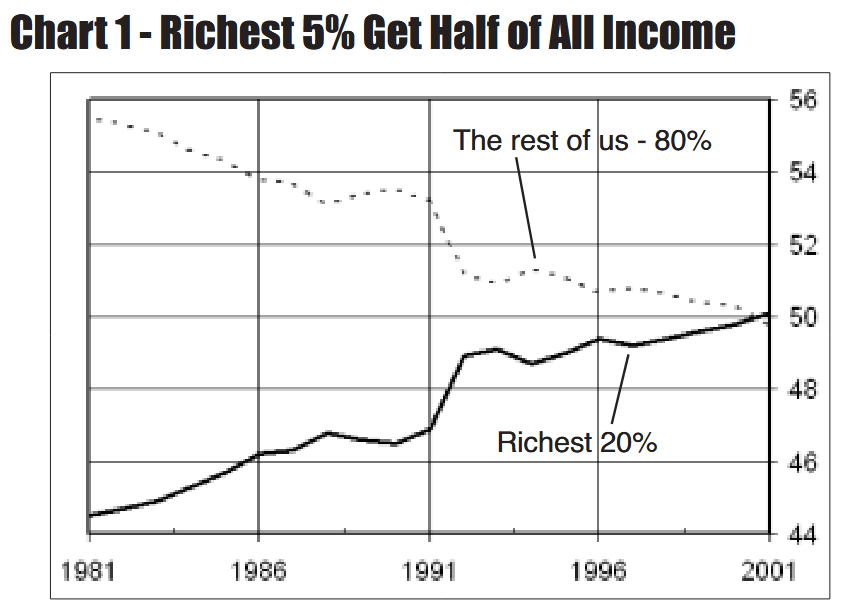
The share going to the rich will increase even more beginning in 2002 as President Bush’s taxcuts were designed to give 53.3% of the benefit to the richest 5%.
The data is from “Historical Income Tables” U.S. Census.
http://www.census.gov/hhes/income/histinc/inchhdet.html
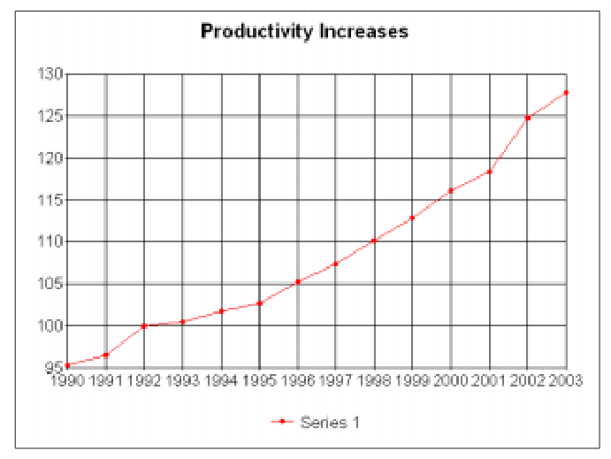
U.S. Workers More Productive than Eve
Productivity means business is able to squeeze more and more work out of fewer workers. The productivity of U.S. workers has been steadily increasing since 1990 and took a big jump after 2001.
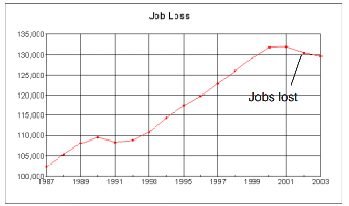
Fewer Jobs, Higher Unemployment
The total number of U.S. jobs grew steadily since 1992 but came to a stop in 2000, then jobs began disappearing.
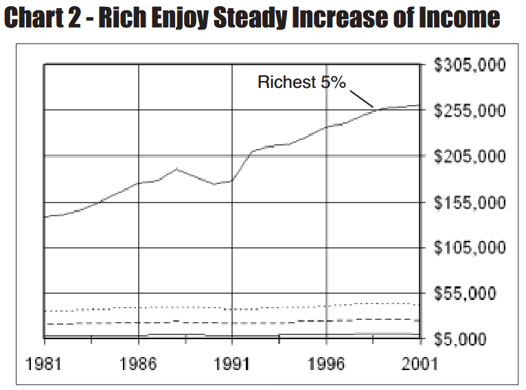
This second chart (above) shows how the income of the very rich has rapidly increased while the income of ordinary workers has increased only slightly. Moreover, the income for the bottom 80% of all households reach their highest point around
1999 and then begins to decline. Income of the richest 5% continued to grow after 1999 and will grow even faster as Bush’s taxcuts go into effect.
The solid line at the top of the chart shows the income of the richest 5% of households. They represent 5,464,850 households. Their average annual income grew from $138,638 in 1981 to $260,464 in 2001. These amounts are in 2001 dollars and are adjusted for inflation (see technical note).
The three lines near the bottom of the chart is 65,578,200 households or 60% of all U.S. households. The dotted line near the bottom is the middle 1/5 of households, with an average annual income of $35,465 in 1981 and $42,629 in 2001. The
dashed line is the next lower 1/5 of households, whose income was $21,492 in 1981 and $25,468 in 2001. The solid line at the bottom is the poorest 1/5 of households with an average income of $8,786 in 1981 and $10,136 in 2001.
Technical notes - the dollar figures in the chart are adjusted for inflation and price changes to account for changes in the buying power of money. The dollar amounts for all dates are in 2001 dollars. The dollar amounts are also averages—the total income received by a particular group is divided by the number of people in that group. This tends to understate the difference in income for the very rich, whose income ranges from $150,000 to billions.